Creating an identity and assets for a funky and cozy restaurant in the heart of Toronto
My role: Brand and identity, copywriting, website building
Challenge: Design an unique and memorable identity for a small, local business with very little technical knowledge
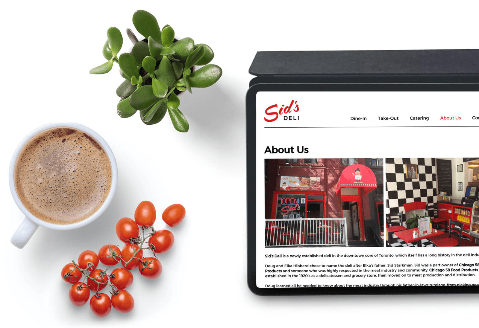
Solution: I did market analysis and brand exploration for the client; once aligned, I also created a website, brand guidelines, and printable assets like menus, uniform specs, and window decals.
Project metrics:
0 to 1
brand and social presence
5+
resources provided to client

Colour palette
Typography
Modified Lobster brings some nice flavour
Lato compliments the script font nicely on web and print
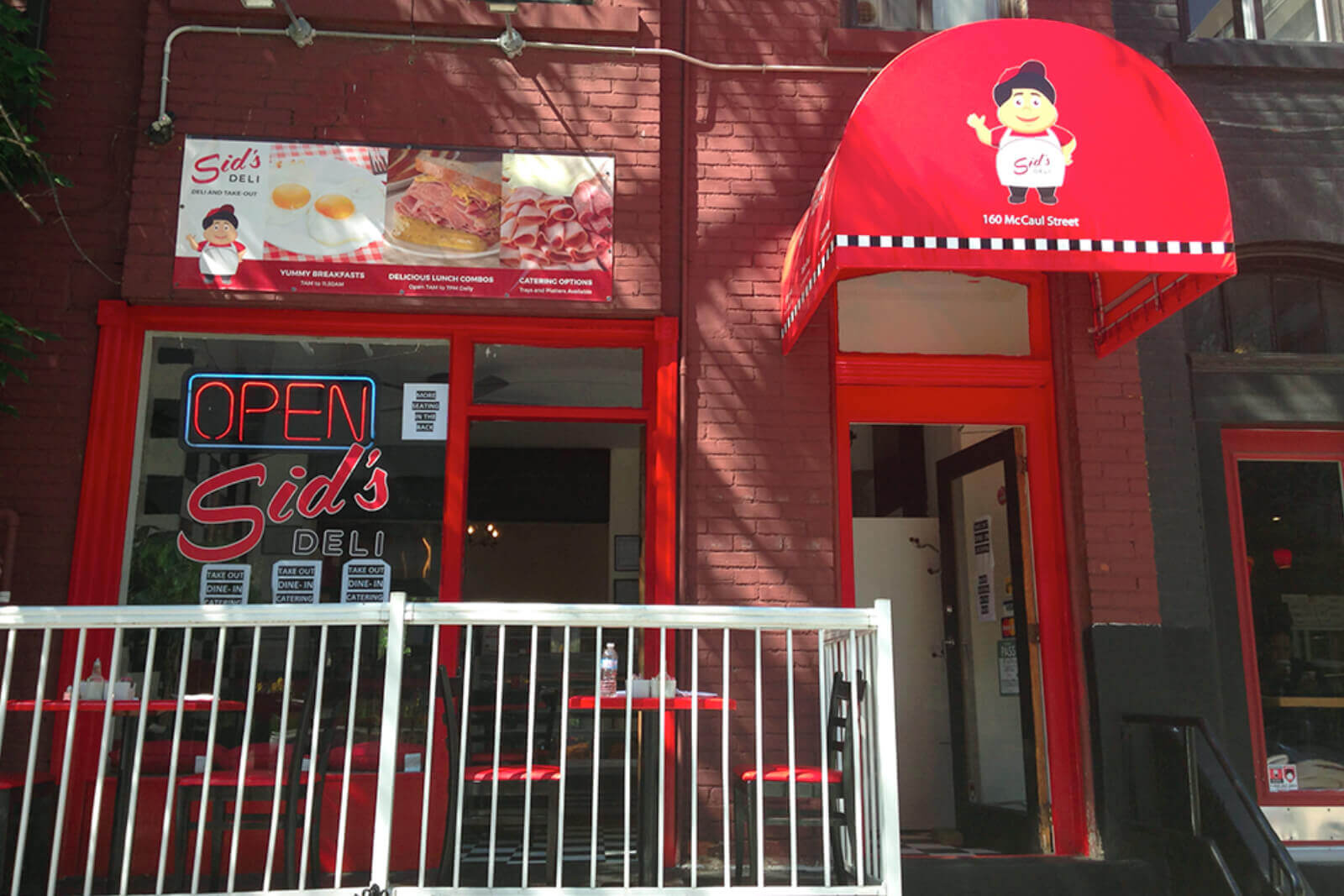
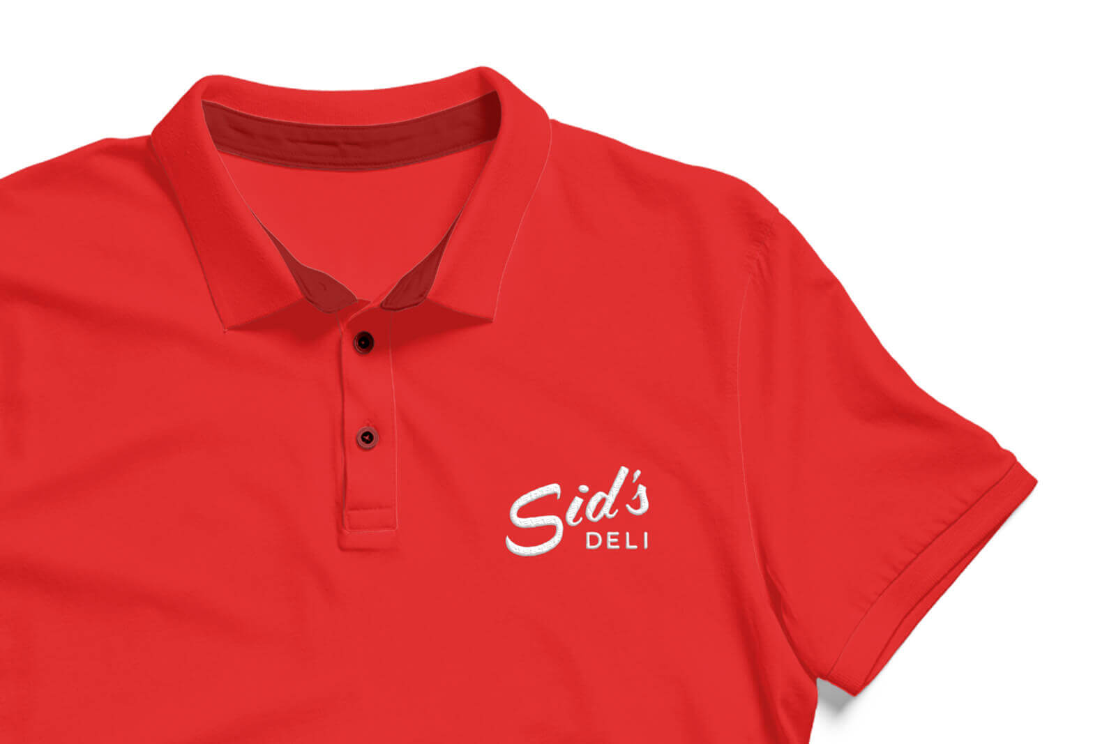
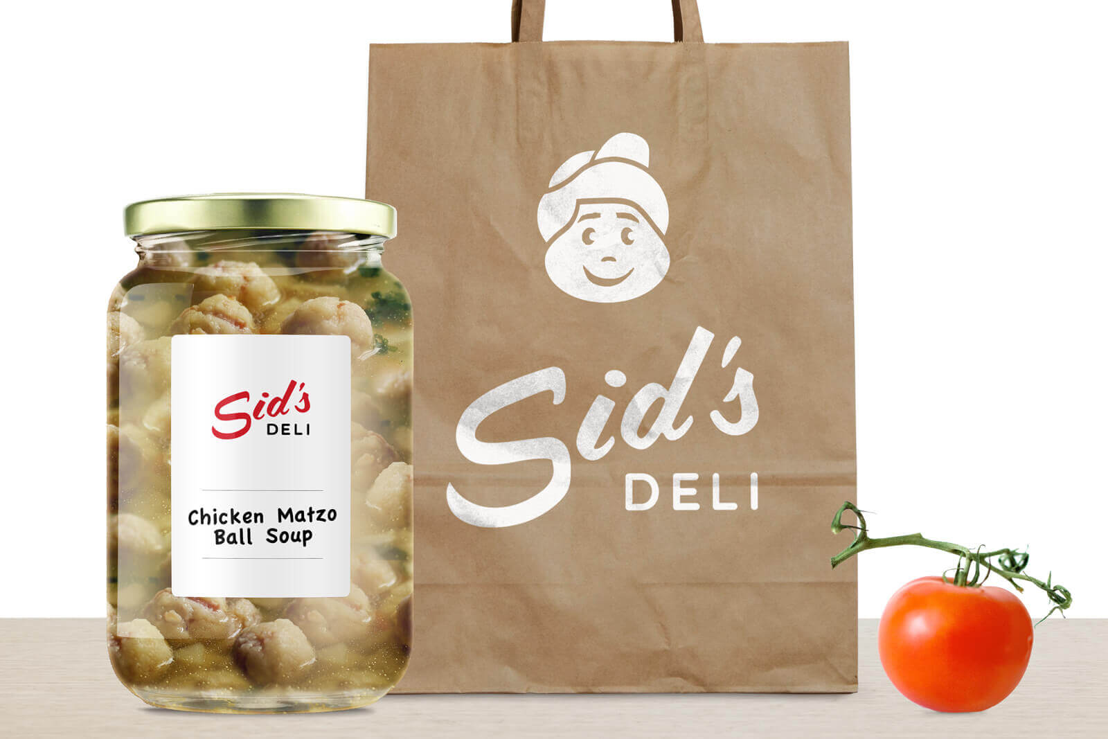
Sid's Deli was a cozy, family-friendly deli in downtown Toronto, owned by people who care deeply about authentic deli food. Corned beef was marinated and slow-cooked in-house, the matzo ball soup was a family-held recipe, and they couldn't resist stocking up on Vernors ginger ale.
The deli unfortunately closed in 2016, but the identity still stands out in the Toronto market.
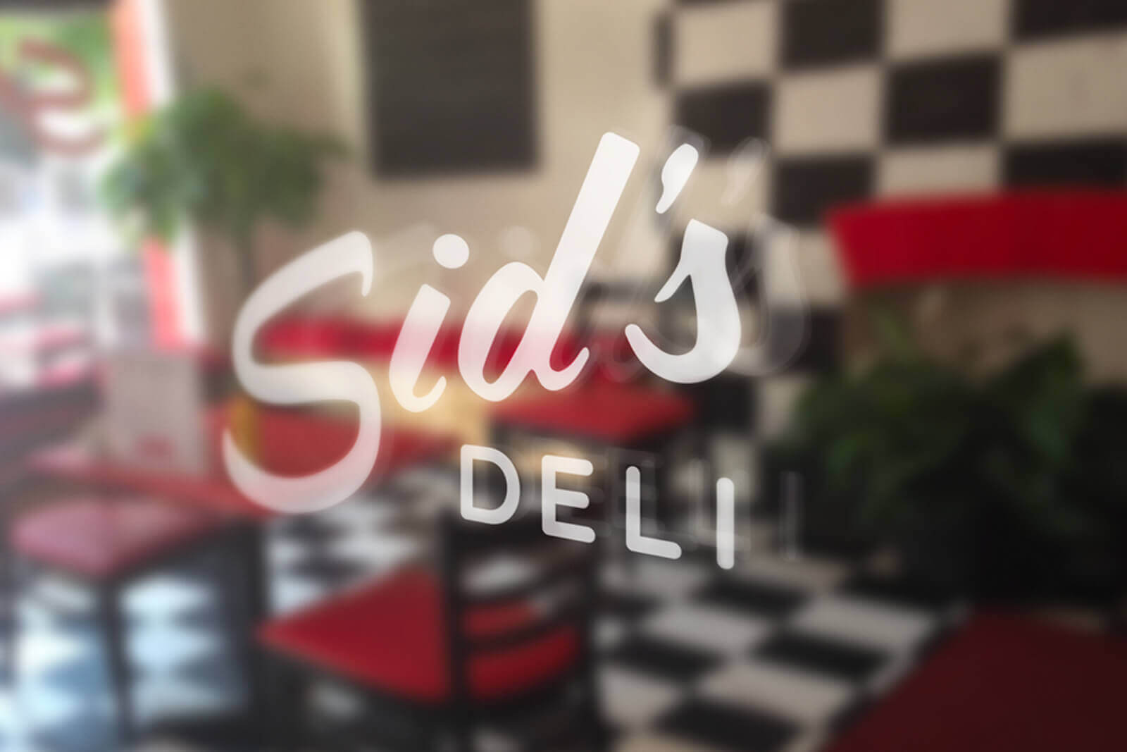
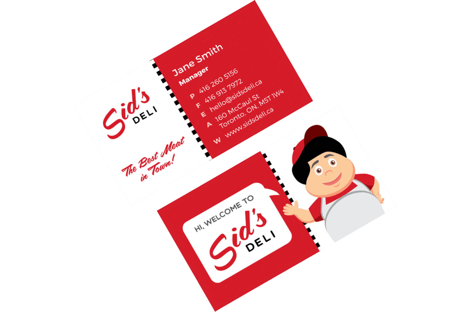
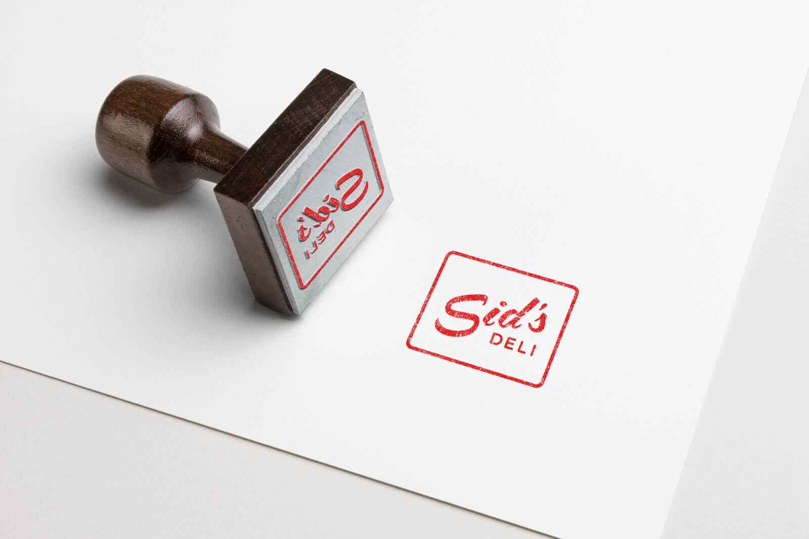
Sid's wordmark
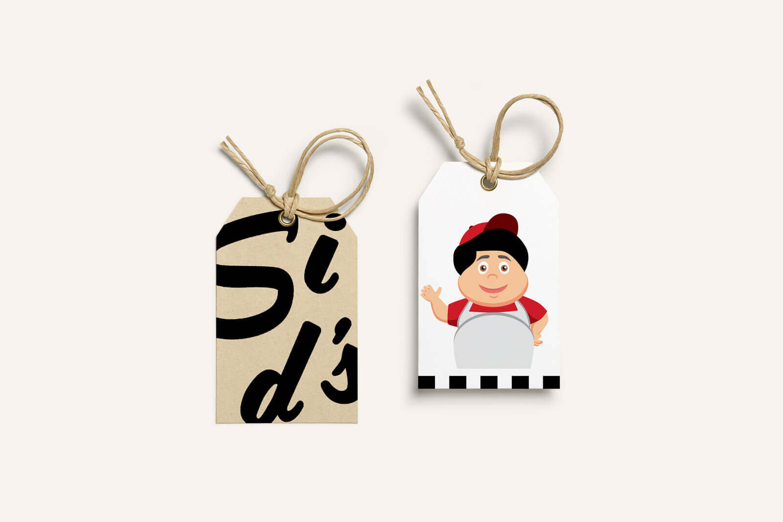
The owners were keen on a 60s funky feel, so it took a few iterations to land on the exact "style" that felt right. Here are some "no's" that stood out most compared to the final illustration style above.

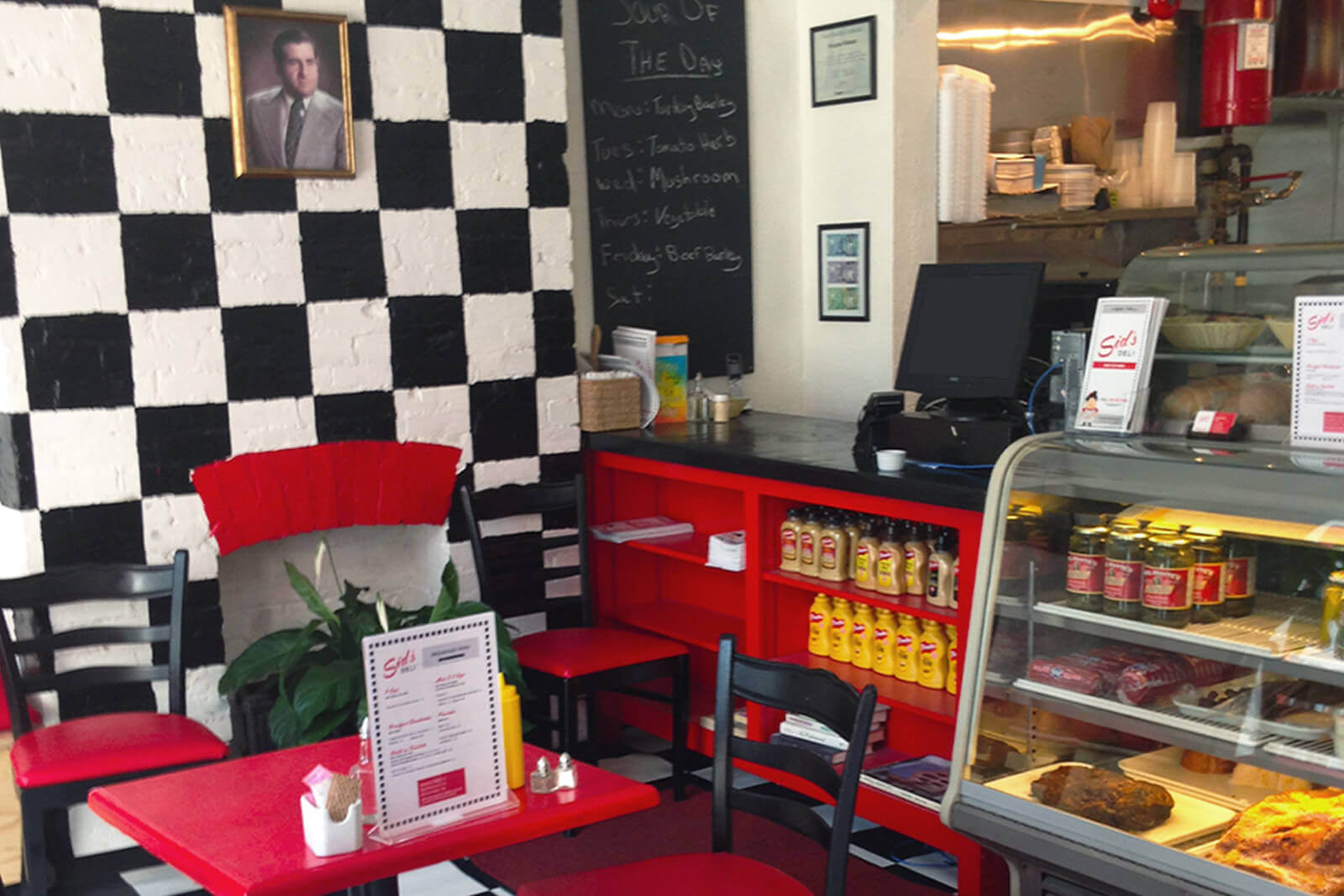
Seeing print
Each asset was designed to be easily reproducible by the owners with their at-home printer. The business cards and menus can easily be printed in black and white, and everything else can be interchanged with white, black, and red accessories: napkins, plates, cutlery, mugs, and even tablecloths.
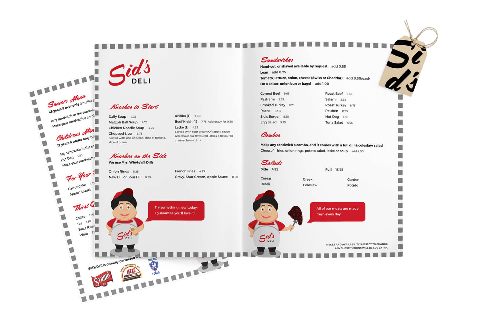

Goodies inside and out
A few yummy sides to accentuate and enliven the inside of the restaurant
Have more time?
Building community with Wave's first culture manifesto
This tool helped Wavers connect with company values and build stronger relationships
See how culture shines ➔

Increasing blog readership by 400%
And building an email design system to unlock 5+ hrs/week for the Marketing team
Read more about the blog ➔