#0031E3
#0014AB
#FF7F00
#FF3300
Classy Helvetica for legibility
Bebas does well as headlines and buttons
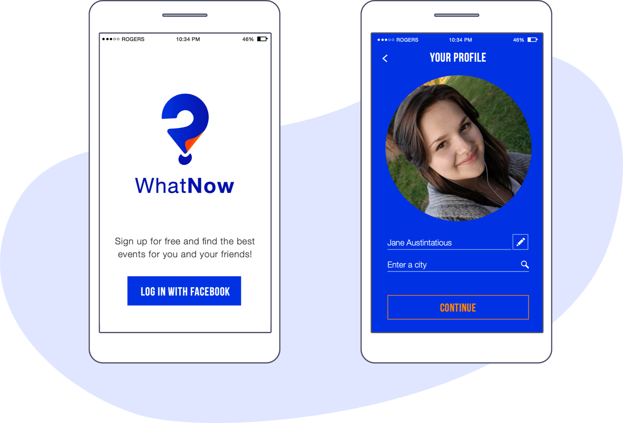
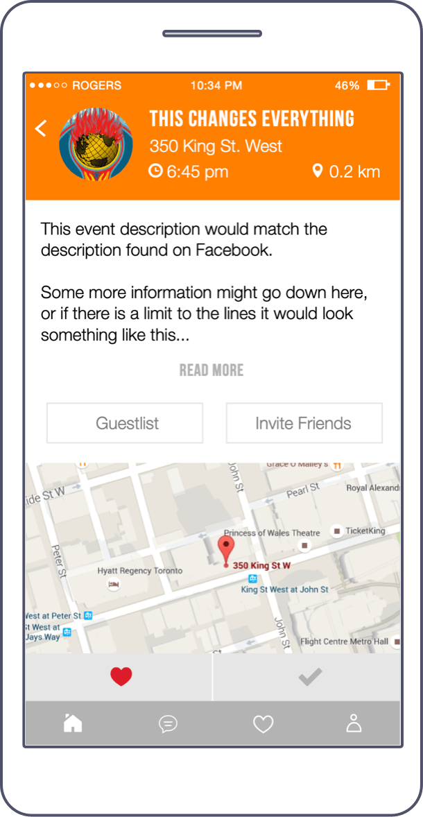
WhatNow was an iOS-first event sharing app that let users discover local happenings based on their interests. I designed a brandmark, a UI library and development standards, and created a prototype to unite stakeholder expectations and development requirements.
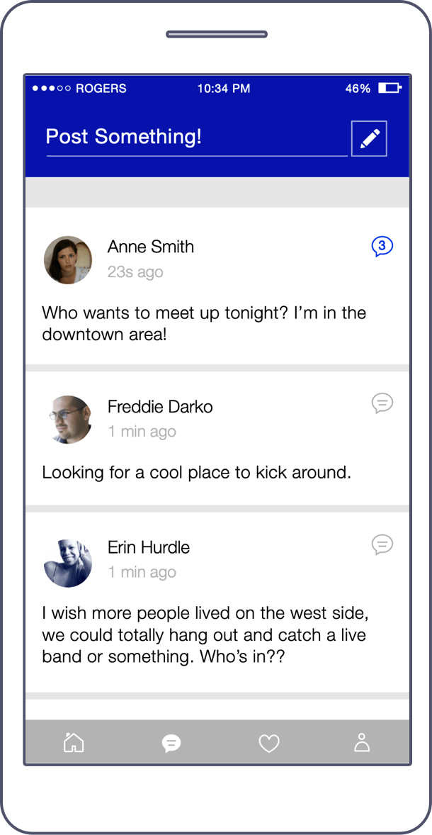
Users sign in through Facebook and get to interact with friends in their local areas to make plans and memories. I proposed a “Community” feature that would let users post and comment on events, which ended up being built to complement the event-exploration portion of the app.
Classy Helvetica for legibility
Bebas does well as headlines and buttons
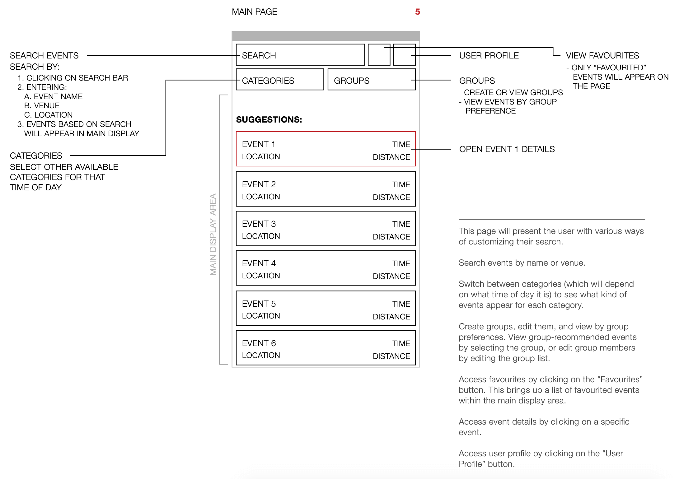
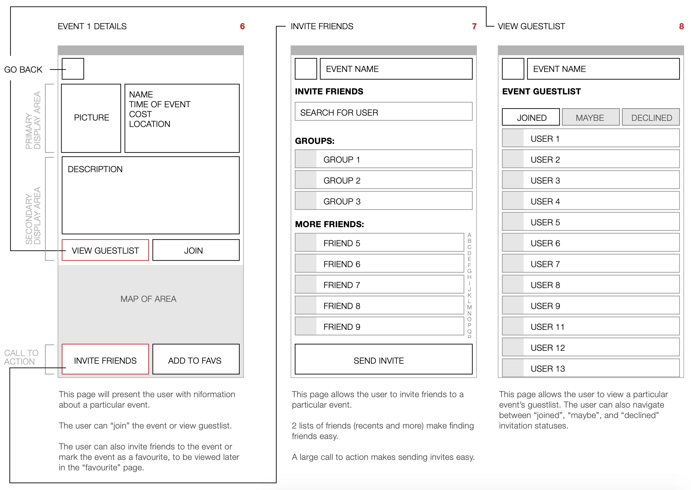
The client’s original idea was to focus on sharing events with the user’s community, and I used this as a starting point to build out what the user could accomplish.
My goal was to make discoverability and sharing as seamless as possible: categorizing events makes them easy to sift through, and the concept of “groups” enables quick sharing with the closest friends.

Stakeholders had mixed ideas about what the logo should look like. I conducted market research to base my proposals on real data, like which apps solved similar options and what tactics they used to continuously engage users.
Below are runners-up to the chosen logo, where I used blue to further differentiate our app from competitors—red (Meetup) and orange (Eventbrite).
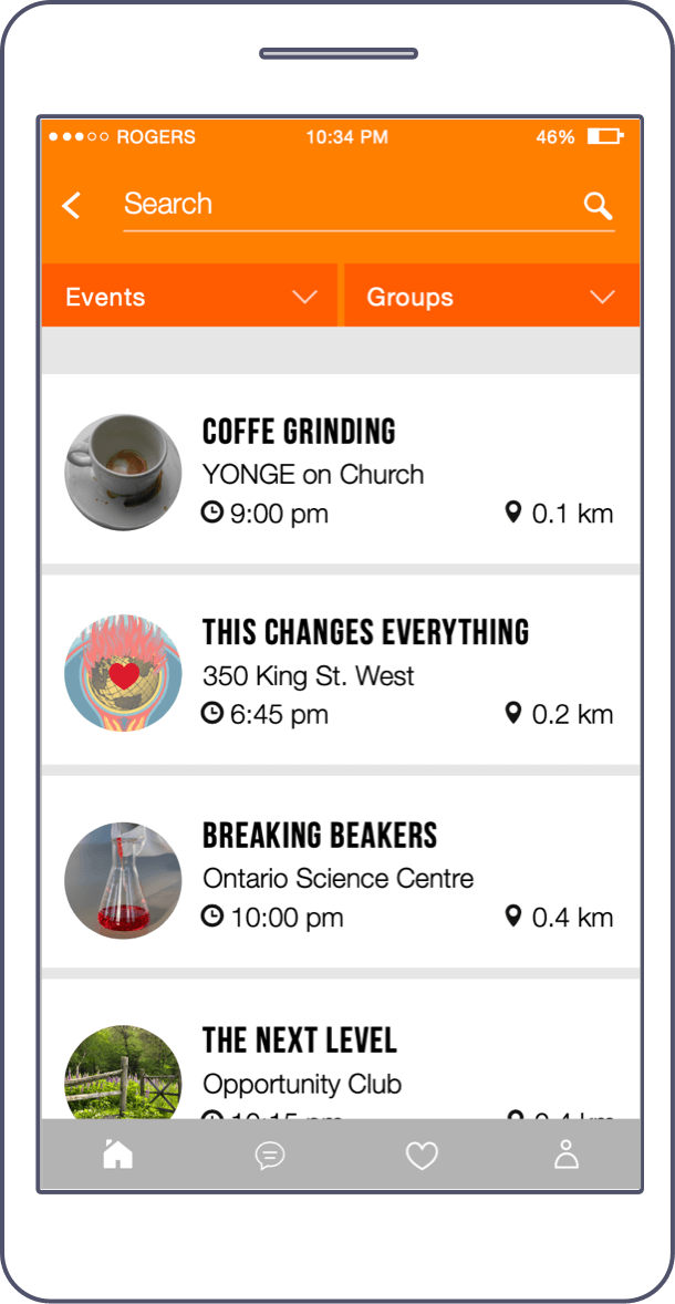
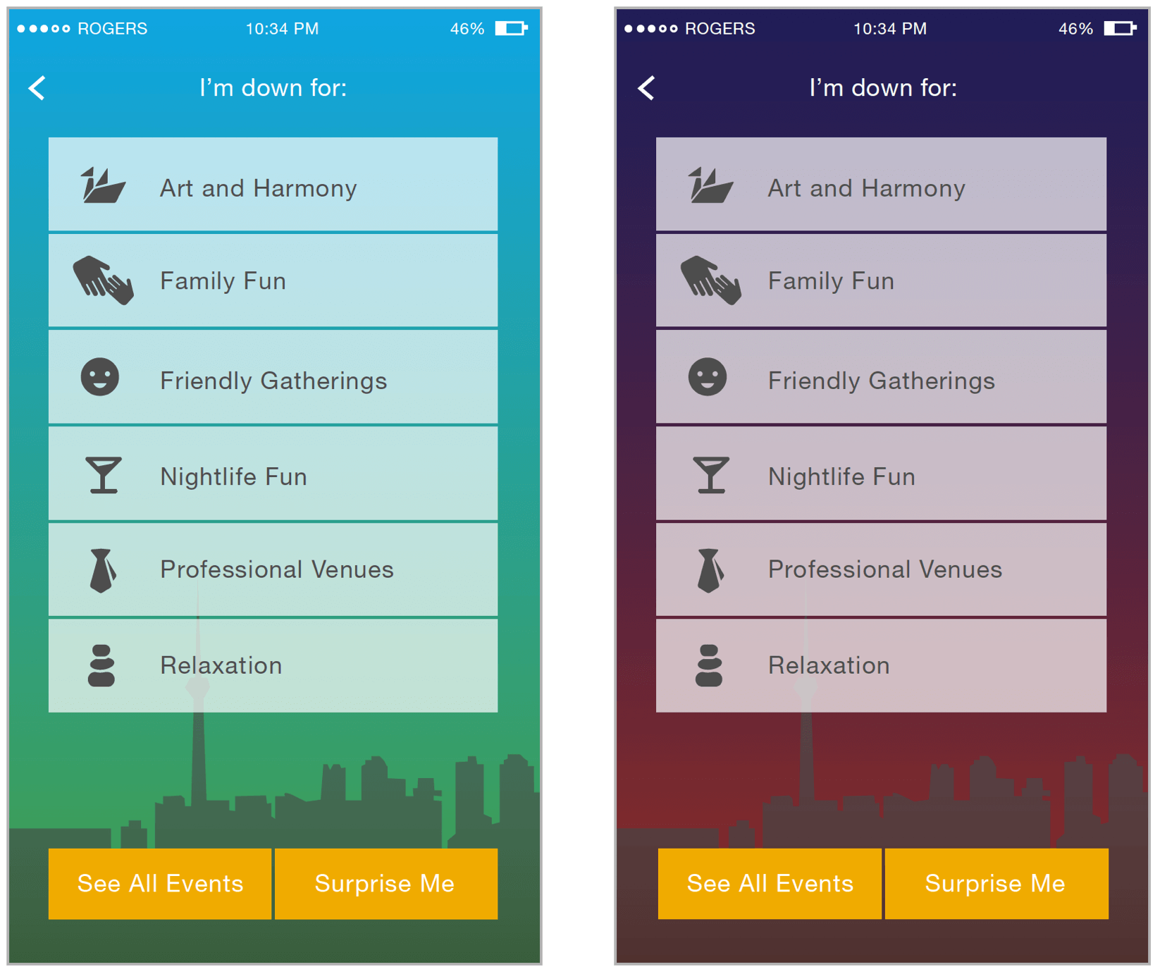
The Category page is the first one the user would see after logging into the app, so we took advantage of the space to help set a mood and get the user excited to continue moving forward.
This approach was casted off because it didn’t provide enough contrast or visual differentiation.
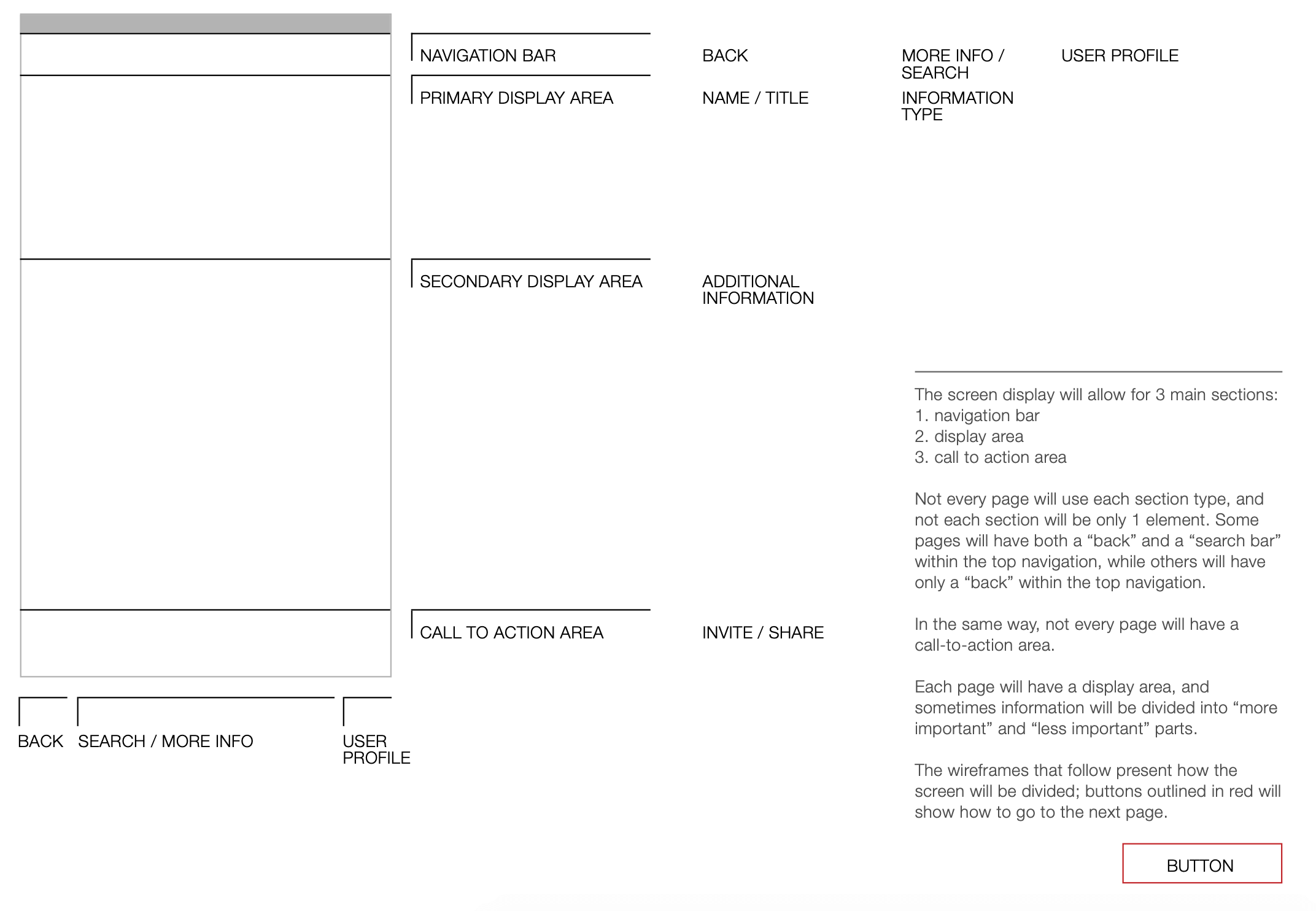
This project required building for iOS first. I focused on establishing design standards and design-to-dev hand off processes that helped speed up development and ensure the final product was future-proofed.
These are some of the elements I kept top of mind:
The final identity and brand experience focus on discovering and creating new memories with the local community. The app was designed to highlight the people using the app, focusing on event details and comments that users leave. The UI remains in the background as a complement to the activity happening in the app.
Building strategy on the cross-functional Point of Sales team
Crafting simplicity and security for business owners
Connecting entrepreneurs with valuable content
A family-friendly deli in Toronto